Knoyo Health 🔓
An AI-driven AVS Health app

AI-Driven AVS Health Tracker
Role
Solo Product Designer
Client
Knoyo Health
Timeline
Spring-Fall 2024
Team
1 Designer, 1 PM (founder)
OVERVIEW
💼 About Knoyo Heath
Knoyo Health is an early-stage digital health startup that is creating an all-in-one patient-facing personal health data management platform. It creates clinical notes tailored for patients and caregivers, centered around the generation of intuitively structured, easy-to-understand, and high-fidelity summaries from patient-provider conversations.
🌟 Project Overview
Problem: Patients often forget important information from an appointment with their doctor. Anything from lengthy medication names to irregular procedures, patients struggle to come up with questions on the spot while keeping track of their medical conditions.
Goal: to create a platform where patients can easily take note of their conversation with the doctor, and to refer back to it with a transcript and AI-generated summary format.
PROCESS
💭 What have Patients Said?
Before I joined Knoyo Health, secondary research had already been done. I will include some relevant findings here for context along with my findings.
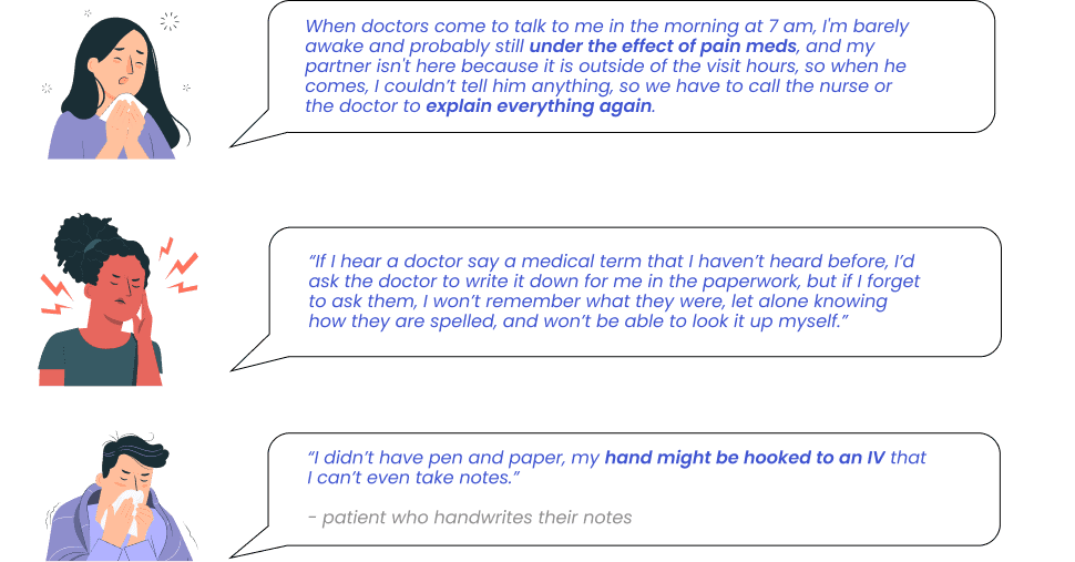
Patients Forget up to 80% of their Conversation
This problem is not surprising, considering that the average person can only hold 5-9 items in their short-term memory. In the healthcare setting, patients additionally face multi-folded barriers to effectively recalling information crucial to their health.
🌟 Why Should We Care?
Insufficient recall and understanding of information from patient-provider discussions lead to poorer health outcomes for patients.
⋅ 20% to 30% of medication prescriptions are never filled
⋅ 50% of medicines for chronic diseases are not taken as prescribed
⋅ Non-English-preferred patients struggle to properly understand treatment plans
🌟 Problem from the Providers’ Perspective
Confusion from patients and caregivers translates to decreased workflow efficiency for providers. A physician disclose spending "on average 10-15%, sometimes the majority of a visit recapping information" from previous visits.
🌟 What is Wrong with Current After-Visit-Summaries ?
After-visit-summaries are currently the main way through which patients can review information discussed during a patient-provider conversation. It is usually a few lines of instructions written by providers that are available in printouts or in the EHR.
⋅ It is read by only up to 67.4% of patients
⋅ Generally 10-30 words only, excluding any of the provider's explanations
⋅ No current tool that easily translates AVS to patient’s preferred languages
⚒ Competitive Analysis
Product Description
Product Limitations
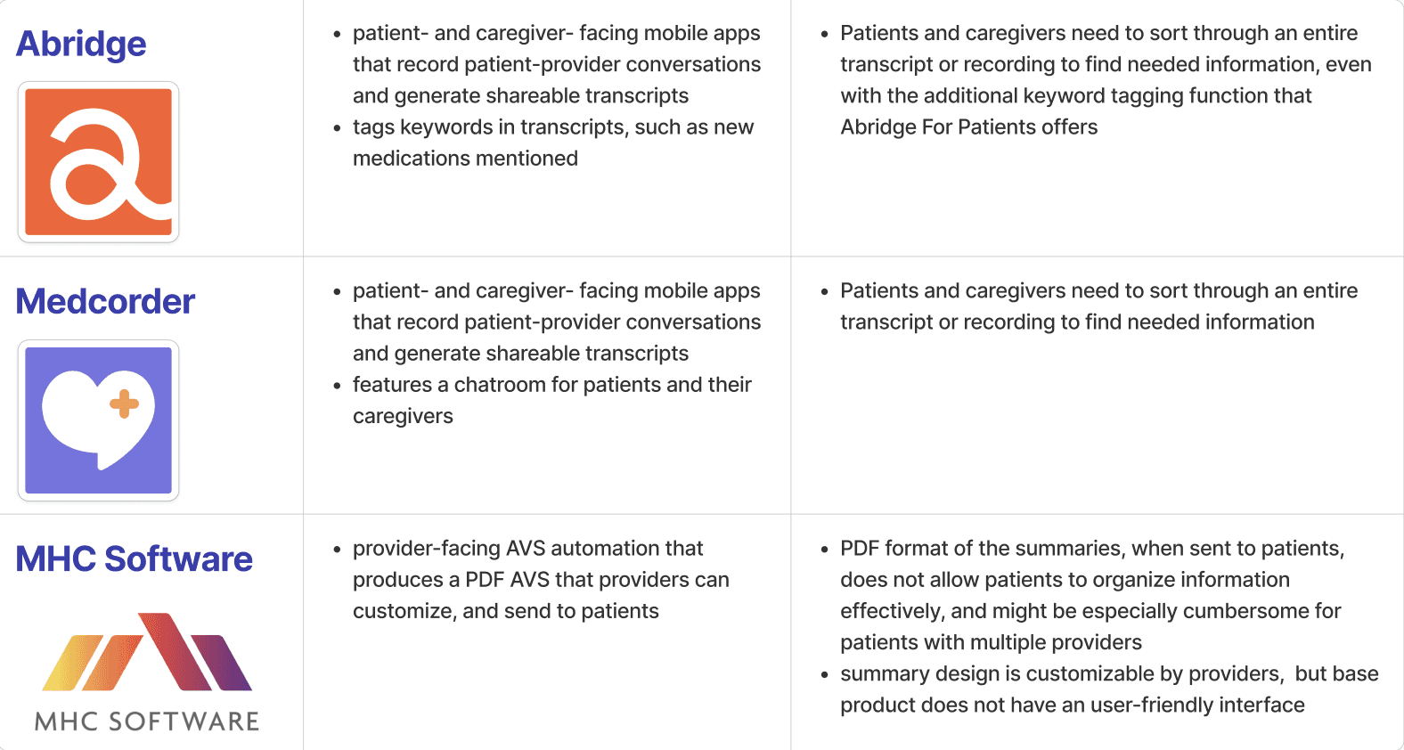
Competitive Analysis
🔗 User Pain Points
After thorough research and a competitive analysis of existing apps, I concluded with some key pain points.
Language Barrier
Multi-tasking during appointment
Inconvenience for doctors
Inadequate AVS
Physical/medical barrier
🌟 Solution
Knoyo Health is a platform that creates clinical notes tailored for the first time for patients and caregivers, centered around the generation of intuitively structured, easy-to-understand, and high-fidelity summaries from patient-provider conversations. Key features described below.
🌟 App Features and User Flow
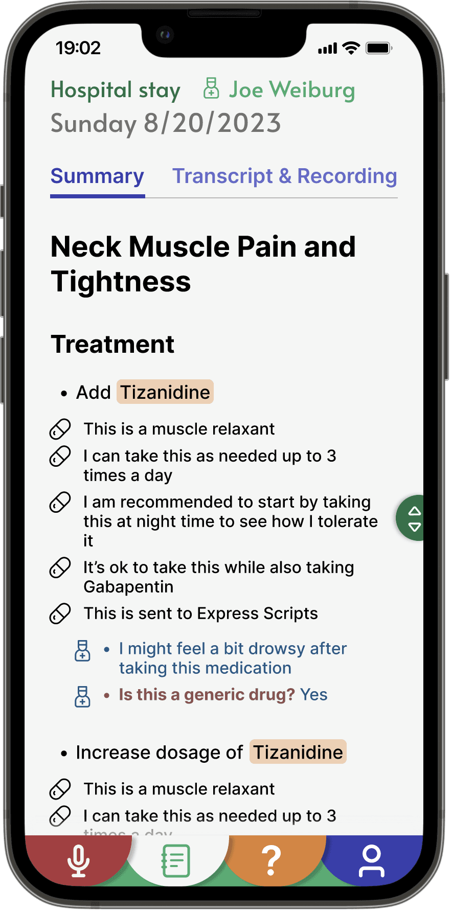
Summary Generation Feature: The mobile app records a patient-provider conversation and generates sharable summaries for patients and caregivers.
Health Data Management Features: The mobile app organizes all summaries in one place for patients and caregivers, and allows them to sort and filter by dates, provider, specialty, and favorites.
Question Generation Feature: Patients can add their own question to the list or get AI-generated questions personalized based on their condition, which provider and specialty, and concerns.
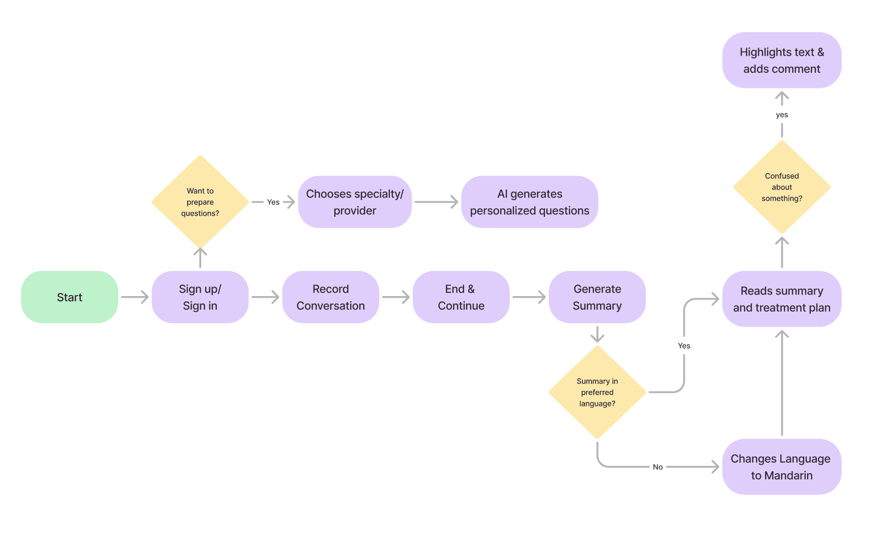
User Flow
⛏ Transcript and Summary Generation
Although the product consists of multiple features, the remainder of this case study will focus on the product’s primary feature : transcript and summary generation.
Summary Generation: records a patient-provider conversation and generates sharable summaries for patients and caregivers.
6-grade level English or the patient’s preferred language.
captures details of the provider’s explanations and organizes them into 4 sections: treatment, testing, follow-up, other discussions
users can share, favorite, and add notes on summaries
🎨 Design and Iteration
Based on these initial feature ideas and basic wireframes given to me, I decided to improvise by focusing on these areas:
reaching product goals by adding specific functions and buttons
enhancing clarity by refining action icons and developing a cohesive design system
adding functionality and preparing for user testing by prototyping
Adding Specific Functions and CTAs
The original design lacks a translation icon from the original language to the user’s preferred language.
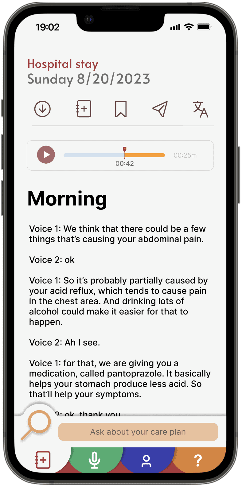
Transcript
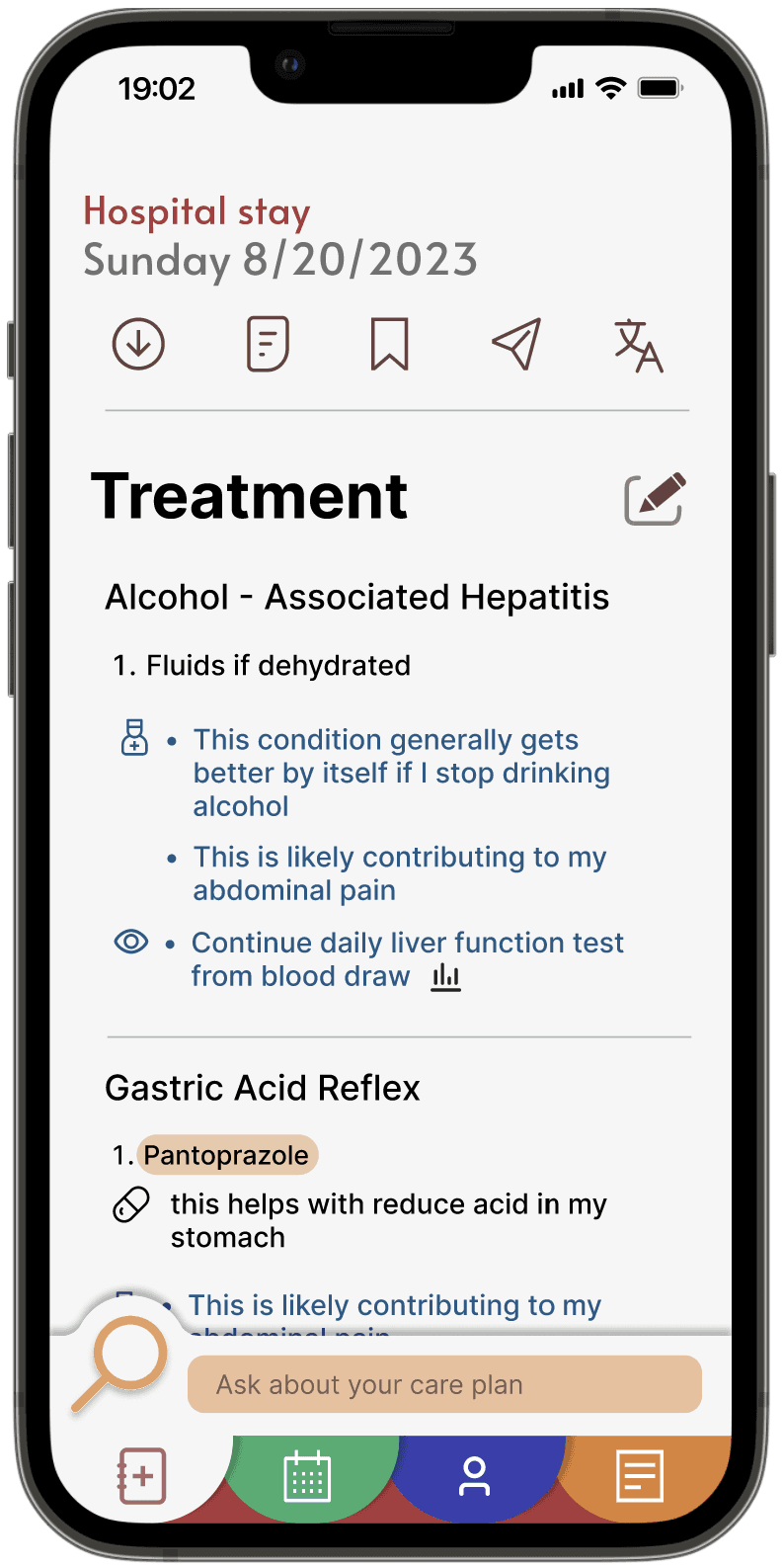
Summary Generation
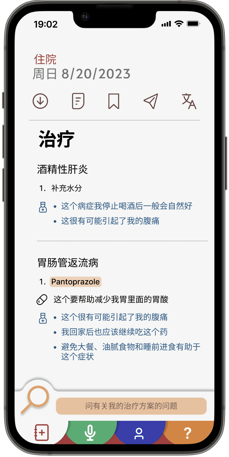
Summary with language preference
Editing Feature: I wondered if users have the right to edit their conversation in areas where they are confused; however, this may cause patients to enter incorrect information that may lead to misunderstanding and inaccurate treatment.
Top bar with icons: the ample number of icons in a nav bar is 5. However, as a “tab” menu with icons, 5 may overwhelm the user, especially when the content is already text-heavy.
Confusing bottom nav menu: I realized having a calendar as one of the main tabs is unnecessary as that can be found in the profile section. Its icon is also similar to the Transcript tab. Therefore, I decided to change it into the recording tab, since it is the feature that should be most accessible by users.
Before I continued iterating, I decided to conduct usability testing along with other features.
📝 Usability Testing
The purpose of a moderated qualitative usability testing is:
⋅ Identifying the problems in the user interface or design of the mobile application
⋅ Uncovering opportunities to improve the software
⋅ Learning about the participant’s behaviors and preferences
This study involved conducting 5 usability tests, where the task scenarios focused on specifically navigating the transcript & summary feature, and the overall user flow of the app.
Research Finding #1
Participants were confused on which the transcript and summary icons are
When asked to find a summary of your conversation, participants did not click on the second icon on the top bar, instead they went to the profile page page from the main menu. This indicates there might be an overuse of icons and overlapping identities.
Research Finding #2
As a text-heavy feature, participants felt overwhelmed
Some participants noted that the layout of the transcript is too crunched together, and the structure of the Summary is not intuitive. For example, is the prescription prescribed or off-the-counter? Have I picked up this prescription already?
Research Finding #3
Participants wanted an efficient way to navigate the summary
Since the transcript and summary are text-heavy, participants desired a way to quickly find what they are looking for instead of scrolling endlessly.
Design Insight #1
Showing only the most important features in an efficient yet ample way
I decided to utilize the 3-dot menu to condense action features except the transcript and summary generation. Instead of showcasing the transcript and summary actions as icons, I changed them into text.
Design Insight #2
Conducting an A/B test on the Summary structure and adding features that help users with tracking information
While some participants suggested switching around the order of subsections in the Summary, others did not mention the structure at all. As an area that does not have enough research to be backed up, I decided to create different summary structures and conduct additional testing.
Displaying Only the Necessary Features
I transferred features such as “share” and “translate” under a new 3-dot menu. If we create additional features in the future, they could go under that as well, so the main transcript and summary features maintain their significance.
With the extra space, I changed the icons into words to clearly communicate the purpose of the features.
Altering the Summary Structure
Based on usability testing, some participants pointed out they would like to categorize the Summary structure by conditions instead of “treatment”, “testing”, etc.
I decided to create a variation of the Summary Structure separating it into conditions. After this has been create, I will conduct an A/B test to identify the most preferred format and set it as default. Eventually, users can change their preferences in settings.
Differentiating Speakers in the Conversation Transcript
The current transcript separates the patient speaker and the caregiver speaker using “Voice 1” and “Voice 2.” This is neglected by users when there is so much content.
After synthesizing other transcript interfaces, I decided color coding the speakers, or formatting the transcript into a texting platform will effectively differentiate speakers and make the interface more spacious.
Adding Intuitive Features to Enhance Navigation
While participants did not explicitly state this, I noticed they took a while to scroll through the Summary content. Adding a scrolling tool will make the process more efficient and user friendly.
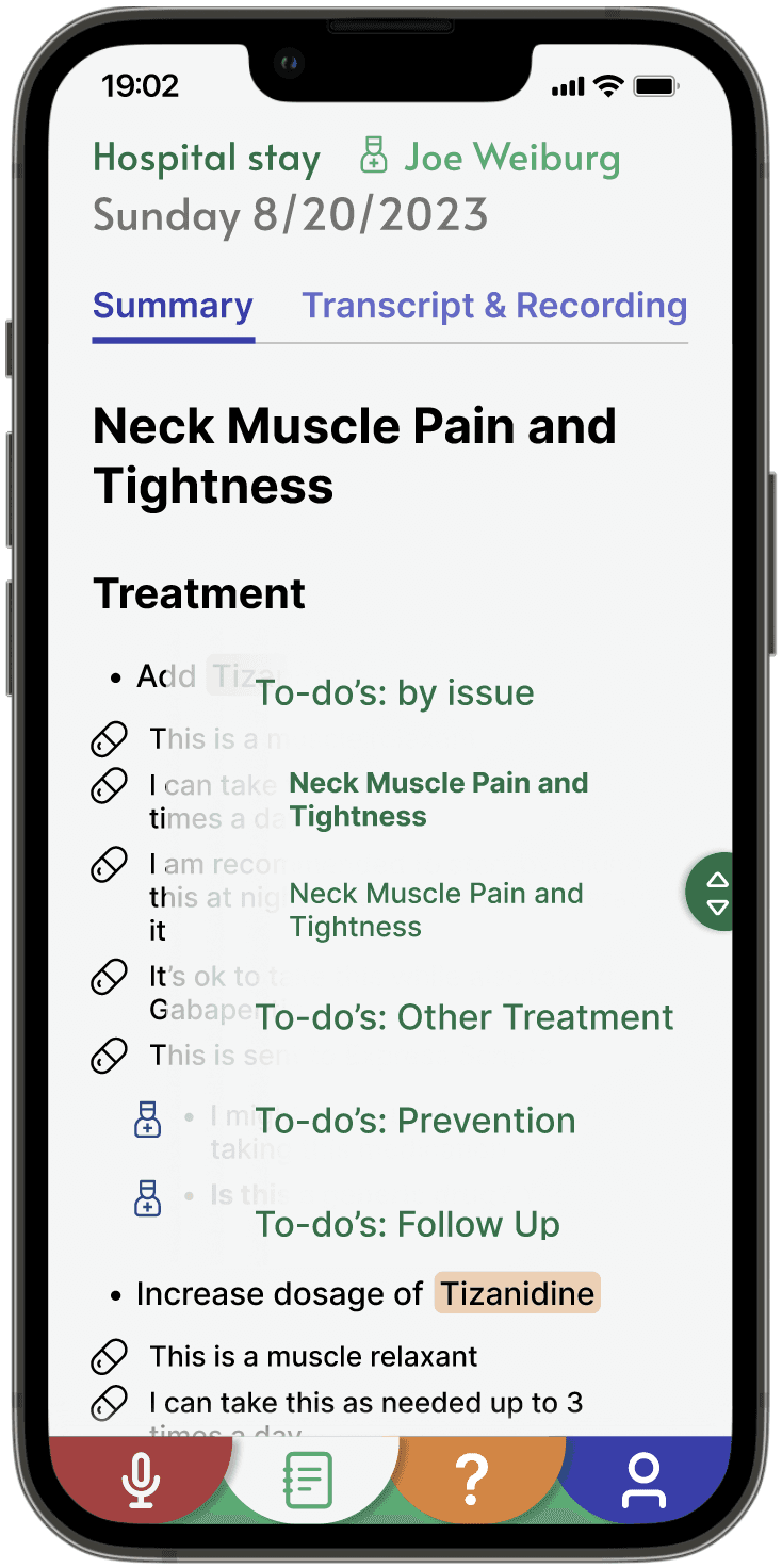
Scroll functionality with outline
Rethinking the Nav Menu
According to 5 users I interviewed, 4 of them said the navigation menu is unclear and inefficiently categorized content. After some iterations, I decided to continue with this finalized menu.
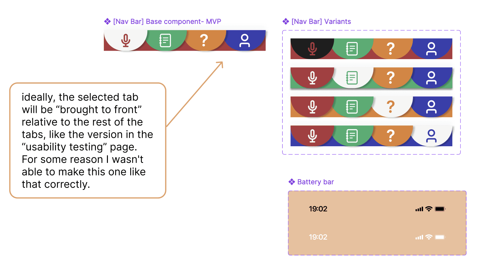
Final Nav Menu
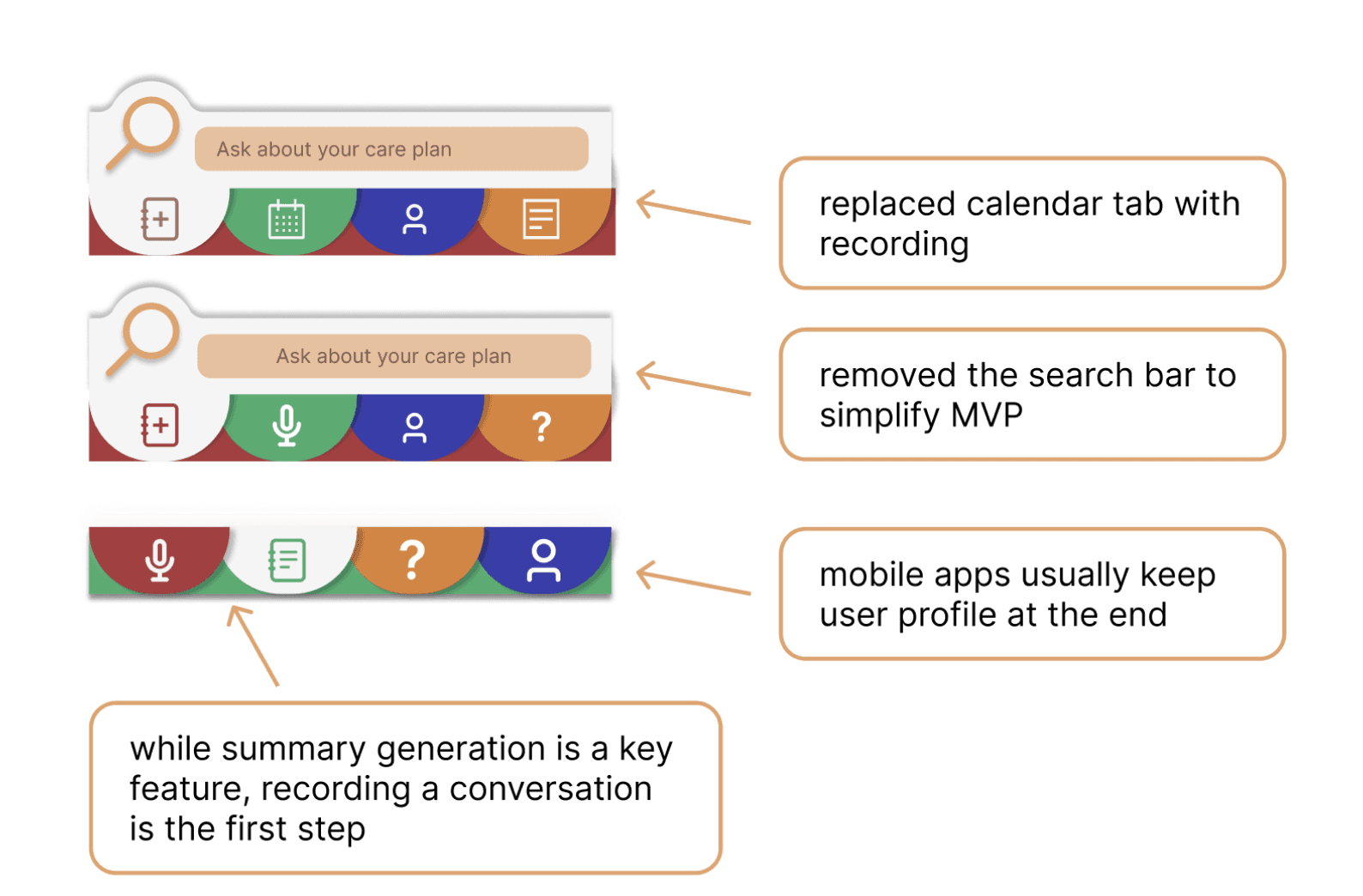
Nav Menu Iterations
Design System
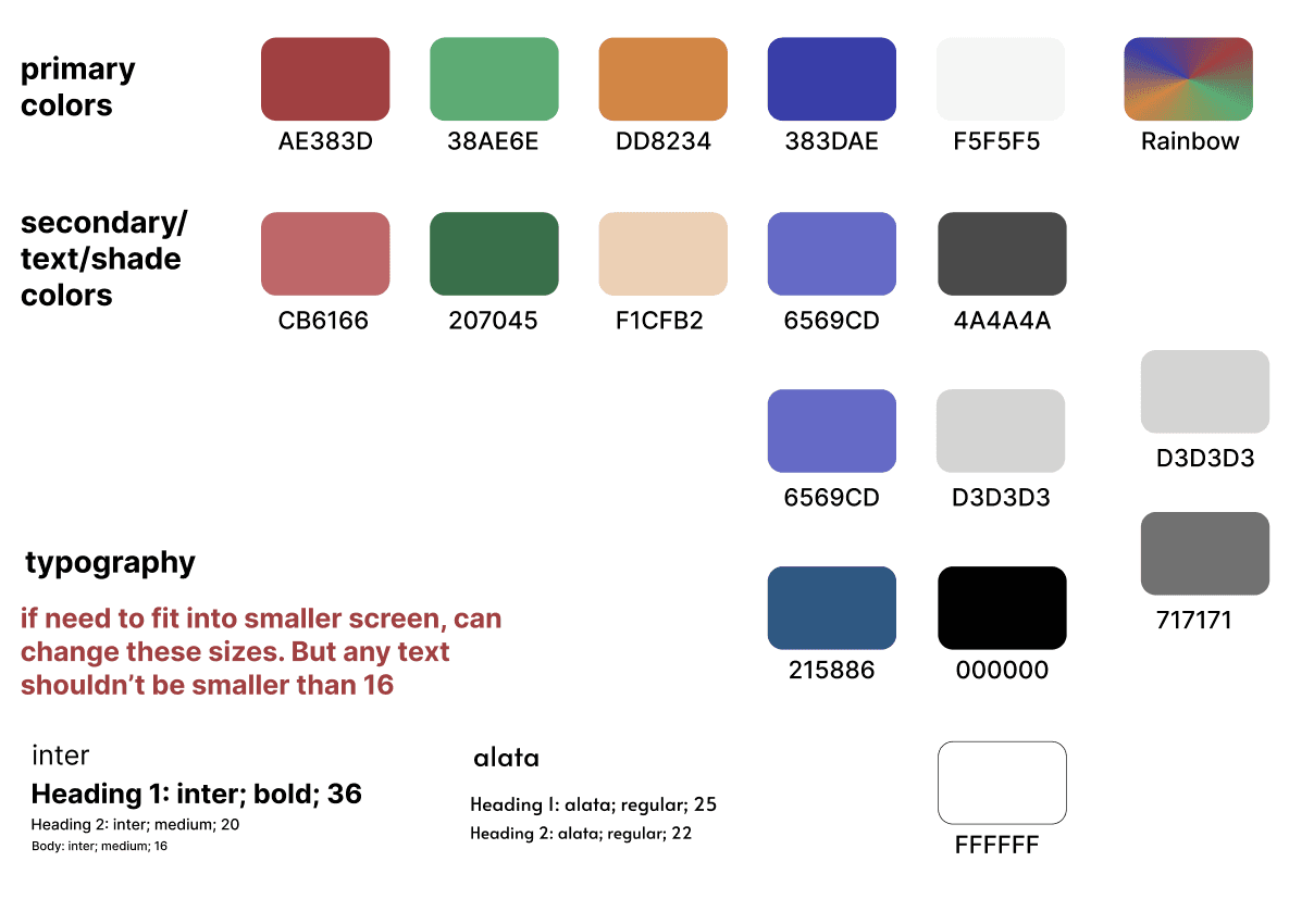
Design System
⛏ Other Features
This case study focuses on the specific Transcript and Summary feature. Below are designs of other screens and features that also play a prominent part of my contribution in the MVP.
Onboarding Page: I created a completely new onboarding page to the MVP of the product.
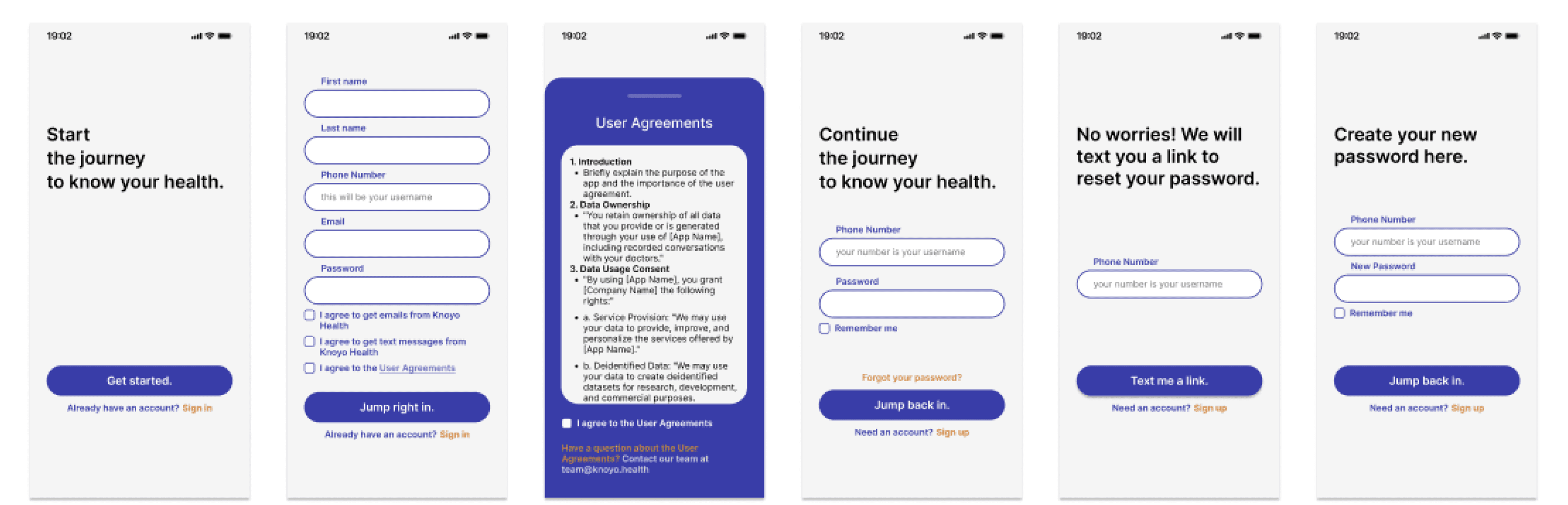
Onboarding Flow
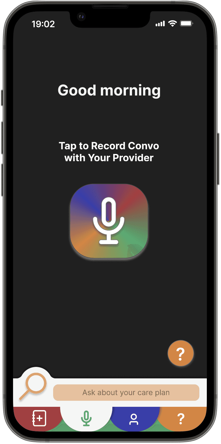
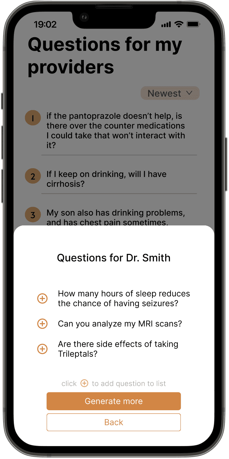
Question Generation Page: Based on my research, users often struggle to come up with questions on the spot, and many of them prefer writing down questions to ask before their appointment. Users stated that they liked the idea of having personalized questions based on the doctor they are seeing.
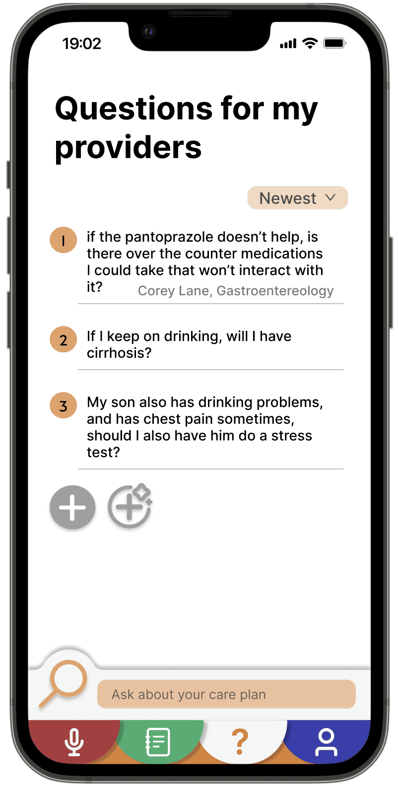
Questions page
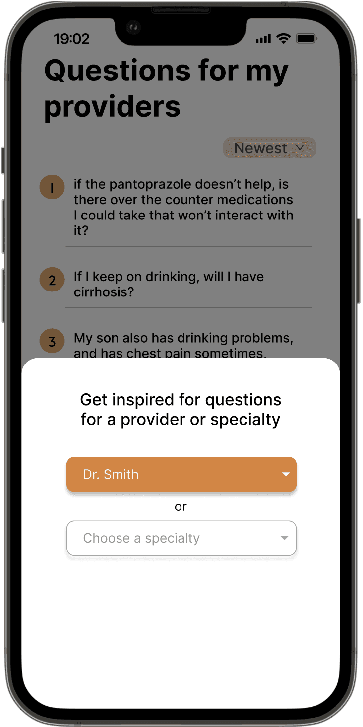
Search for AI-generated questions
based on provider or specialty
Add AI-generated questions
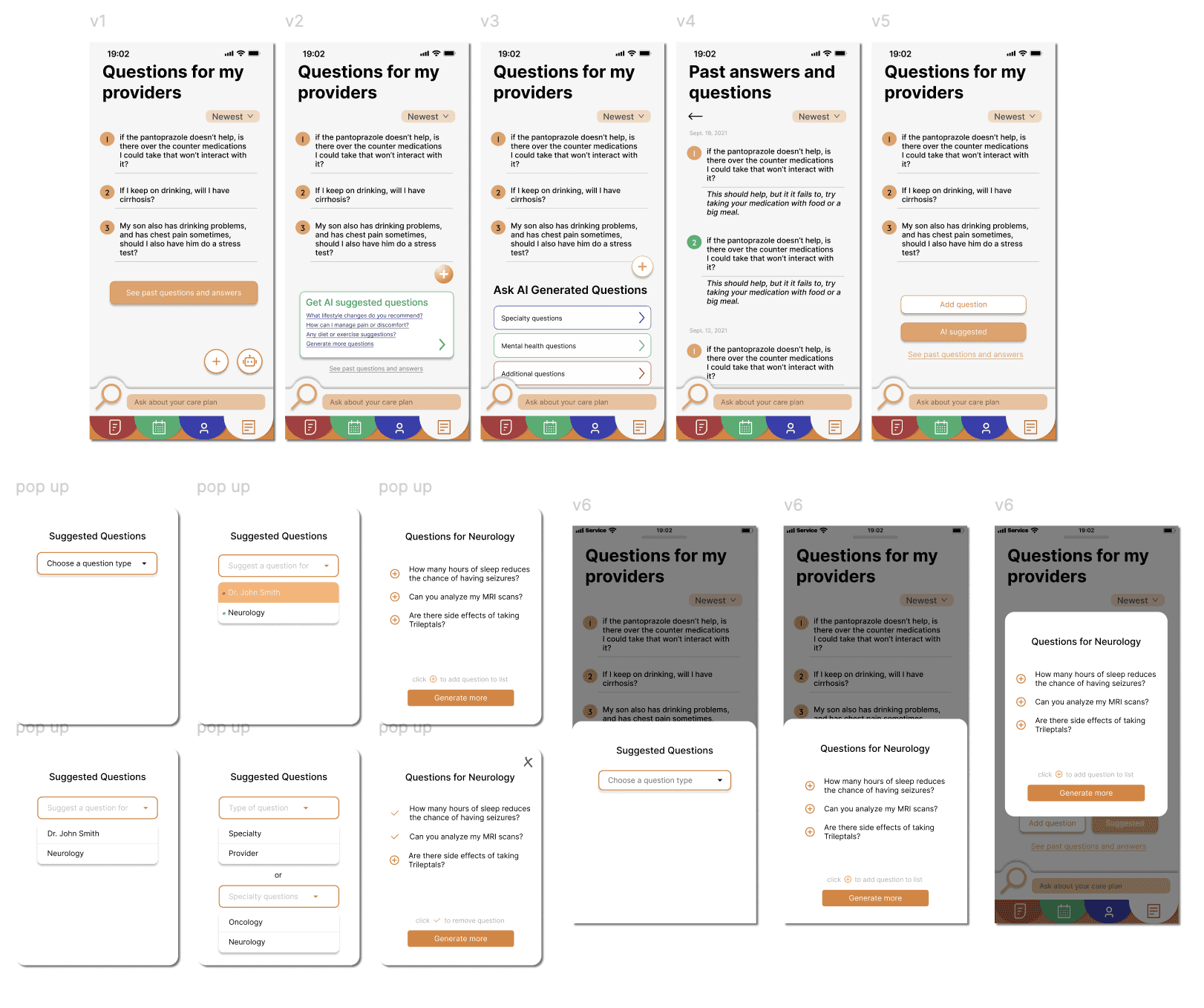
Iterations of Question Generation screen
Healthcare Notes & Calendar: This section lets users find their healthcare notes and view upcoming or past appointments with providers.

Healthcare Notes Overview & Calendar
RESULTS
MVP Prototype
Due to the nature of an MVP and our timeline of developing a basic application first, some additional features and changes were not updated in the prototype.
💪 What Now?
As this is still an ongoing product, I am currently revising the design system and adding more components to ensure consistent UI.
I am also studying iOS mobile design patterns to better align this product with recent trends and fundamental iOS structures.
I’m actively reaching out to more users to conduct usability test while updating the prototype.
💌 Reflection
This is considered a long-term project for me where I was able to work closely with the CEO. This allowed me to understand a product from a more business perspective. The focus isn’t just on design, but what values the features can bring, and how we can produce this in the most efficient way.
✨ Don’t add features when it is not necessary
I focused on adding many options under the 3-dot menu, however, I realized a lot of these are not necessary and even redundant. I learned that I should not design for abundance, but for simplicity.
✨ Interacting with particiants
I conducted 5+ interviews throughout this project. During the first one, I was nervous and told the participant more than necessary. I learned that I should let the participant explore and focus on their behaviors. If I have to explain something to them, it may suggest there is a flaw in the experience.
San Francisco, CA